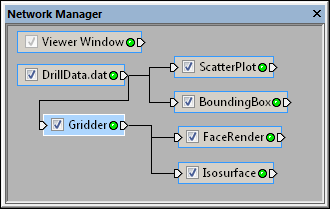
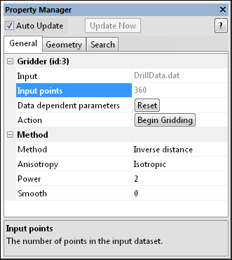
The Gridder module is selected in the Network Manager. The selected module is highlighted in blue.
The properties
of the selected module are
displayed in the Property
Manager.
The Property Manager displays the properties of the module currently selected in the Network Manager. A property is a setting or parameter used by the module to control its behavior. Each property is displayed in a list within the window with one property per line. Properties are split onto multiple tabs. Left-click on a module in the Network Manager to display its properties in the Property Manager.
 |
 |
The Gridder module is selected in the Network Manager. The selected module is highlighted in blue. |
The properties
of the selected module are |
The Property Manager displays module properties, which are settings or parameters used by a module to control its behavior. The window itself consists of several tabs with similar properties, on a single tab.
A title bar is displayed
at the top of the window. It consists of the window name, the  button, and the
  button. See
the Working With Voxler Windows
topic for more information about how to use these buttons.
Click the  button to obtain
information about the module currently displayed in the Property
Manager. The Voxler help
window is displayed with the relevant help page.
The Auto Update check box and Update Now button below the title bar allow you to choose whether to update the Viewer window automatically or manually. The Auto Update check box is checked, by default. If a process takes a long time or you want to make a large number of changes to different modules that take a long time to redraw, then uncheck the Auto Update box. Make all changes to all modules. After all changes have been made, press the Update Now button to update the network manually. When the Auto Update box is checked, the module properties automatically update after you change an object. Uncheck the Auto Update box at the top of the Property Manager to disable this feature and make multiple changes without updating the Viewer window.
The  button manually updates the network and any modified modules when Auto Update is unchecked. The Update Now button is enabled whenever
there are pending changes to the network. Click the Update
Now button to manually update the module properties in the Viewer window. Alternatively, choose
the Network | Update Network command
or press the F9 key on the keyboard to update the Viewer
window with all changes.
The main component of the Property
Manager is a list of properties used by the selected module, separated
by tabs. This list has two columns: the left column contains the property
name. The right column contains the controls used to change the property.
Click on the property control in the right column to change the property's
value. Drag the vertical line between the left and right column to adjust
the column width. If a module's properties contain subsections, a  or
or  is located to the left of the name. Click on
  or
or  to expand or collapse the list.
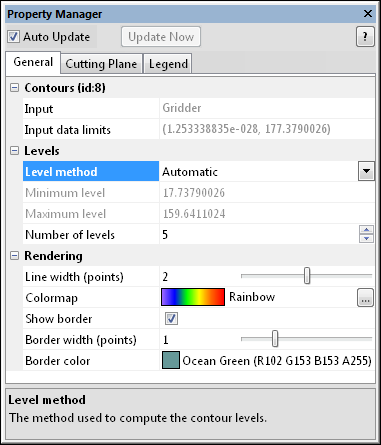
For example, a Contours module
contains three tabs: General, Cutting
Plane, and Legend.
The General tab contains
three sections: Contours, Levels,
and Rendering. Additional
properties, such as the Level method,
can be changed by clicking on the tab and opening these sections.
A short description of the selected property displays at the bottom of the window. If this area is not visible, click the Tools | Options command and check the box next to Show property help on the General page of the Options dialog.
Each property is displayed in a list within the window. Use the scroll wheel on the mouse to scroll through the list.
Features with multiple options appear with a  or
or  to the left of the name. To expand a group, click on
the
  icon,
select the item and press the + key on the numeric keypad, press the right
arrow key on the keyboard, or double-click the item. To collapse the group,
click on the
  icon, press the
- key on the numeric keypad; press the left arrow key; or double-click
the item. For example, the expanded Rendering
section in the above image contains four options: Line
width (points), Colormap, Show border, Border width (points), and
Border color.
To change the size of either column of the Property
Manager, position the cursor over the center vertical line to change
the cursor into a two-headed arrow  . Drag
the arrow left or right to resize the viewable area on either size of
the line.
To resize the help area at the
bottom of the Property Manager,
position the cursor just above the help area and drag the cursor  up or down to create more or
less viewable help area.
A simple help section is available at the bottom of the Property
Manager for help on the selected property. The help area is turned
on or off with the Tools | Options
command. The horizontal dividing line at the top of this section can be
dragged up or down. Click the  button at
the top of the Property Manager
to display more detailed information in the online help file about the
module currently displayed in the Property
Manager.
Voxler provides several different types of controls in the right column of the Property Manager that allow you to customize the behavior of a selected module. These controls include buttons, check boxes, drop down lists, edit boxes, sliders, and spin buttons. The focus is automatically set to the object when it is clicked or selected via the keyboard TAB or arrow keys. The focus is indicated by a dotted rectangle on the control or by a change in color. Some property list items only provide information. These items are disabled (grayed) to indicate they cannot be changed. Occasionally, some properties may not be valid due to other selections or data restrictions. These options are disabled as well.
The following controls are available:
Button |
Click the button with the mouse or
press the SPACEBAR when the button has the focus to perform the
action indicated by the button text. Click the |
Check Box |
A check box toggles the state between one of two possible outcomes. Click the check box with the mouse or press the SPACEBAR when the box has the focus to change the state of the check box. |
Color |
The color control displays a sample and the name of the current color. If the color cannot be found in the predefined colors list, then the name takes the form "r, g, b" (the amounts of red, green, and blue, 0 to 255 each). To change the color, click the color to the right of the Color property to open the color palette. |
Drop Down List |
A drop down list of options displays when the corresponding property value is selected. To display the drop down list, click the value with the mouse or press the SPACEBAR when the control is selected. To select an item in the drop down list, click the item in the list or use the up or down arrow keys on your keyboard to highlight the item and press ENTER.
Use the keyboard keys to perform the following actions:
|
Edit Boxes |
Edit
boxes allow the input of text or numeric values. Edit boxes are
commonly linked to an associated slider |
Slider |
A
slider appears to the right of a property that requires a numeric
entry. Drag the slider
The slider is set to reasonable limits, but Voxler accepts a larger range of values from the edit field for some properties. In such a case, enter the number directly in the edit field. |
Spin Button |
A
spin button |
Static (Grayed-Out) Text |
Static text is informational and cannot be edited, as indicated by the grayed-out color of the text. |
Keyboard Commands
Use the following keys when working in the Properties window when the property name is selected:
The UP ARROW key selects the previous property.
The DOWN ARROW key selects the next property.
The LEFT ARROW key selects the previous property or collapses the list of a parent property.
The RIGHT ARROW key selects the next property or expands the list of a parent property.
The PAGE UP key moves the selection up by the height of the window, scrolling if necessary.
The PAGE DOWN key moves the selection down by the height of the window, scrolling if necessary.
The HOME key selects the first property.
The END key selects the last property.
The TAB key selects the next property that accepts keyboard input (similar to a dialog). It skips collapsed items as indicated by the (+) button to the left of the item. Use the arrow keys to navigate to a collapsed item.
SHIFT+TAB selects the previous property that accepts keyboard input (similar to a dialog).
See Also